Badger
Badger is a Framer component that transforms a list of comma-separated items into style-able badges or tags. It supports direct input and CMS fields. It has extensive styling options to perfectly match your design system.
Installation
Find the component's url in the Frame+ PDF that came with the order in the email.
Copy the component's url.
Go to your Framer project.
Select a layer you want to use the component in, e.g. Desktop.
Paste the component, Ctrl/Cmd + V. Framer will automatically detect a component add it to your Assets. The component will show up in the project with the default "Badger badger" badges.
(Optional, but recommended) Go to Assets and update the component. If possible, there will be a clickable "Update" next to the component's name.
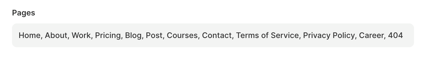
Add a list of items separated by commas (e.g. Home, Blog, Contact) to the Items field in the Badges control. List can be assigned from a CMS field through variables.
Themes
Create a theme in Badger's editor controls. You can use a default name or rename it, hold to the name as it will be needed in the next step.
In your items list, in the "Badges" control or a CMS field, add the theme to an item by separating them with a colon e.g. Home:theme1, Blog:Content, 404:error.
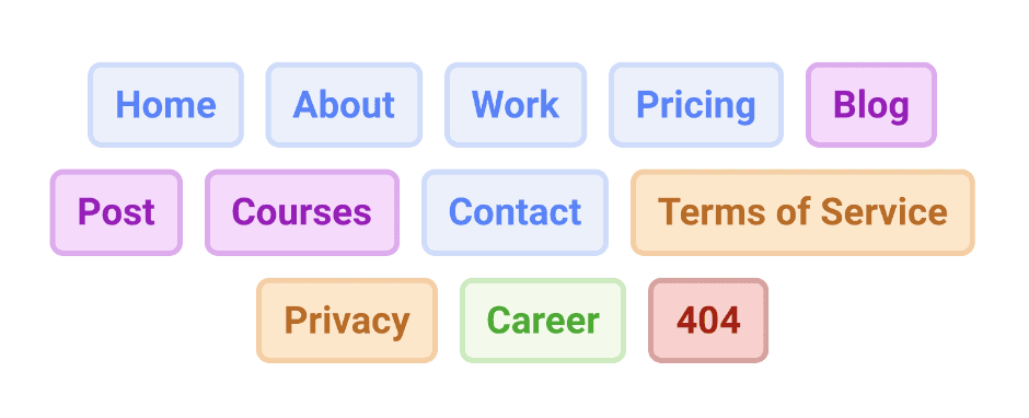
Tip: Keywords feature is a great way to apply a theme without specifying it for each tag explicitly. You can add multiple keywords to each theme and it will apply to every matching item.