TextPlus
TextPlus is a component that allows you to style text in ways that are unavailable in the default text element in Framer. It provides more control over the text's appearance, such as font size, letter spacing, line height, text alignment, and more.
Installation
Find the component's url in the Frame+ PDF that came with the order in the email.
Copy the component's url.
Go to your Framer project.
Select a layer you want to use the component in, e.g. Desktop.
Paste the component, Ctrl/Cmd + V. Framer will automatically detect a component add it to your Assets. The component will show up in the project with the default "TextPlus: Add text here" text.
(Optional, but recommended) Go to Assets and update the component. If possible, there will be a clickable "Update" next to the component's name.
Controls
Text type
Type of a text that will be the subject of the "Content" control.
“Plain text”, for a simple, inline phrase. It should be used with short text, one-liners like a heading, a post title, or a marketing phrase.
“Rich text” for a formatted text. It should be used with long text, like blog posts’ content coming from CMS’ formatted field.
Content
Text that will be processed by the component. It can be a direct input or supplied through a variable e.g. from the CMS.
Content
Text that will be processed by the component. It can be a direct input or supplied through a variable e.g. from the CMS.
Content
Text that will be processed by the component. It can be a direct input or supplied through a variable e.g. from the CMS.
Tag
HTML tag that will hold the Content. Available if Text type is set to "Plain text".
Tag
HTML tag that will hold the Content. Available if Text type is set to "Plain text".
Tag
HTML tag that will hold the Content. Available if Text type is set to "Plain text".
Controls
Determines the level of control that the plugin’s controls should offer.
Standard uses predefined units, matching controls of the Framer editor.
Advanced provides open input controls supporting any valid CSS units and functions. It assumes you are comfortable with CSS, especially units and basic properties' characteristics - or are ready to learn them.
Both modes have the same scope, on the high level they cover the same features.
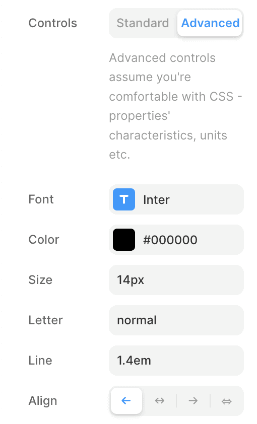
Font
Text styling controls.
Font
Text styling controls.
Font
Text styling controls.
Color
Colour for the text.
Color
Colour for the text.
Color
Colour for the text.
Justify
If set to “On” adjusts letter-spacing and word-spacing to make the text fall flush with both, left and right, margins.
Justify
If set to “On” adjusts letter-spacing and word-spacing to make the text fall flush with both, left and right, margins.
Justify
If set to “On” adjusts letter-spacing and word-spacing to make the text fall flush with both, left and right, margins.
Decoration
Defines text's decorative lines
Decoration
Defines text's decorative lines
Decoration
Defines text's decorative lines
Line
Style of the decorative line to apply to the text.
Line
Style of the decorative line to apply to the text.
Line
Style of the decorative line to apply to the text.
Thickness
Size of the decorative line. Available if Line is set to Underline or Strikethrough
Thickness
Size of the decorative line. Available if Line is set to Underline or Strikethrough
Thickness
Size of the decorative line. Available if Line is set to Underline or Strikethrough
Underline
Size of the space between the text and the underline. Available if Line is set to Underline.
Underline
Size of the space between the text and the underline. Available if Line is set to Underline.
Underline
Size of the space between the text and the underline. Available if Line is set to Underline.
Transform
Defines how a text should be capitalised.
Transform
Defines how a text should be capitalised.
Transform
Defines how a text should be capitalised.
Text Overflow
If set to "Ellipsis" hides overflow and adds ellipsis (three dots, …) at the end of a text.
Text Overflow
If set to "Ellipsis" hides overflow and adds ellipsis (three dots, …) at the end of a text.
Text Overflow
If set to "Ellipsis" hides overflow and adds ellipsis (three dots, …) at the end of a text.
Lines
Number of lines after which text will be clipped and overflow hidden. Available if Overflow is set to Ellipsis.
Lines
Number of lines after which text will be clipped and overflow hidden. Available if Overflow is set to Ellipsis.
Lines
Number of lines after which text will be clipped and overflow hidden. Available if Overflow is set to Ellipsis.
Initial (Drop cap)
Number of lines that the initial letter should occupy. Applied to the first letter of the first paragraph.
Initial (Drop cap)
Number of lines that the initial letter should occupy. Applied to the first letter of the first paragraph.
Initial (Drop cap)
Number of lines that the initial letter should occupy. Applied to the first letter of the first paragraph.
© 2024 Belar
© 2024 Belar
© 2024 Belar